At the beginning, I carried out a market analysis together with Aldin's team, which quickly showed me that the websites of competitors were used more as pure information pages. We decided to take a completely opposite route. We wanted to turn the entire website into a presentation that you could really immerse yourself in.
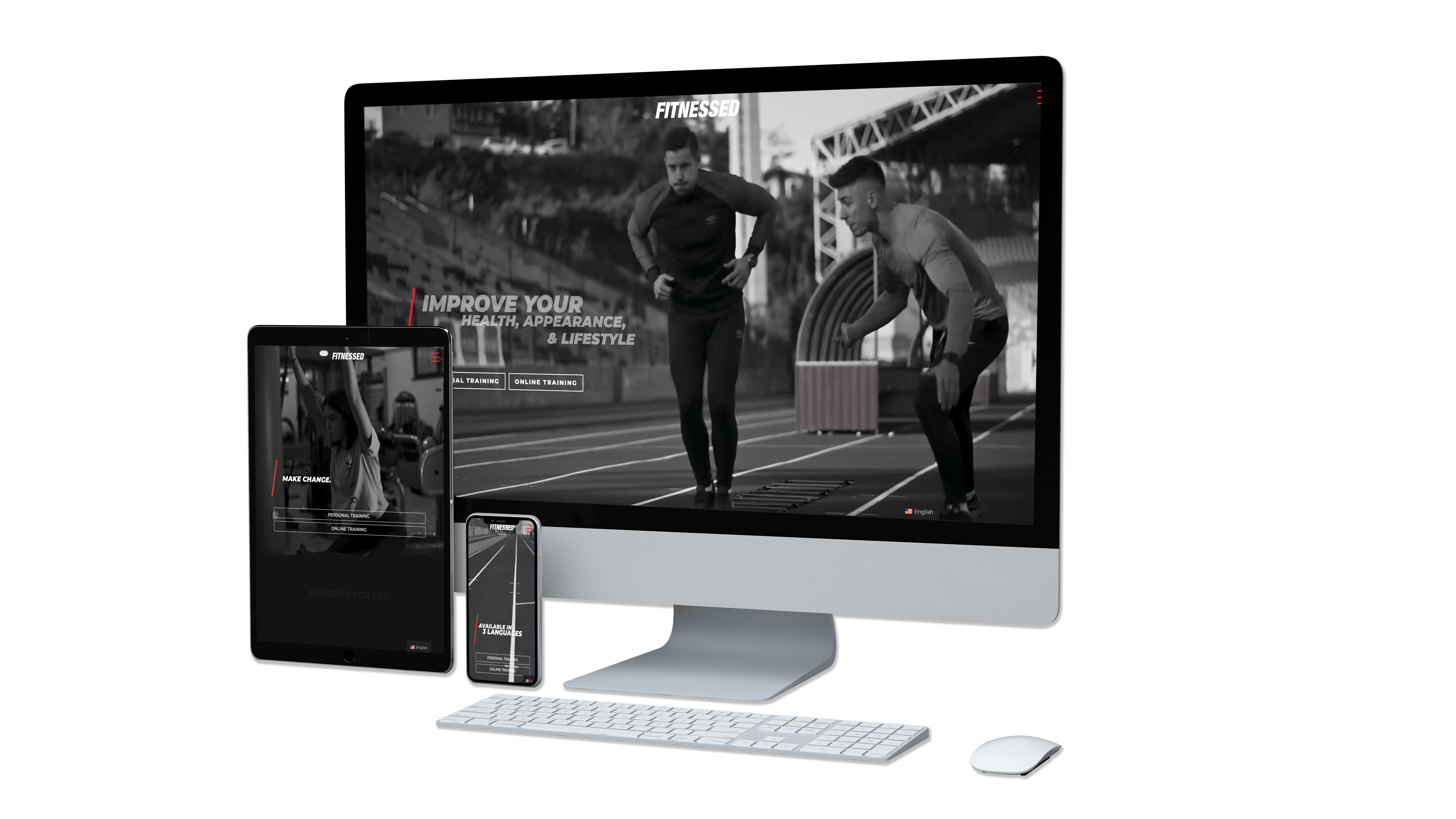
I defined the advantages and functions that should be in the foreground for each section of the website. Then I created an individual design for each of these sections. That brought the website and the appearance to a completely new level. It was important to provide three languages: English, German and Bosnian, since the company aims the D.A.CH and Balkan regions. An eye-catching hero section will drive the user to continue exploring the website.
Aldin started to freelance as a personal trainer in his early ages, so he already had some clients he worked with. For the user research I invited some of those clients and conducted some user interviews. I asked the clients specific questions on how they want to be informed about new companies, they work, and who is behind the companies face. What they think about online trainings and what would drive them to attend one. The interview helped me to get a good overview of the client needs, and made the decision what features to implements on the website easier.
Starting to sketch, wire and mock creates a rough prototype how the end results could look like. I work with AdobeXD, so sharing my work with the client is made as easy as it gets. Getting constant feedback even from other sources, helps to lift projects to a higher level. The public version of the website is made with Divi, so the client has the opportunity to change things quickly and easy. A coded version is on my Github. During the coding process I tested the website with real end-users, so I make sure the website provide a satisfied user experience.
Getting sketch inspirations for fitnessed.net was very difficult. Presenting all my animations and transitions ideas with a pencil and a paper, was not easy at all. For the company to visualize my drawings I had to give 101% at the presentations, so everyone could catch up.
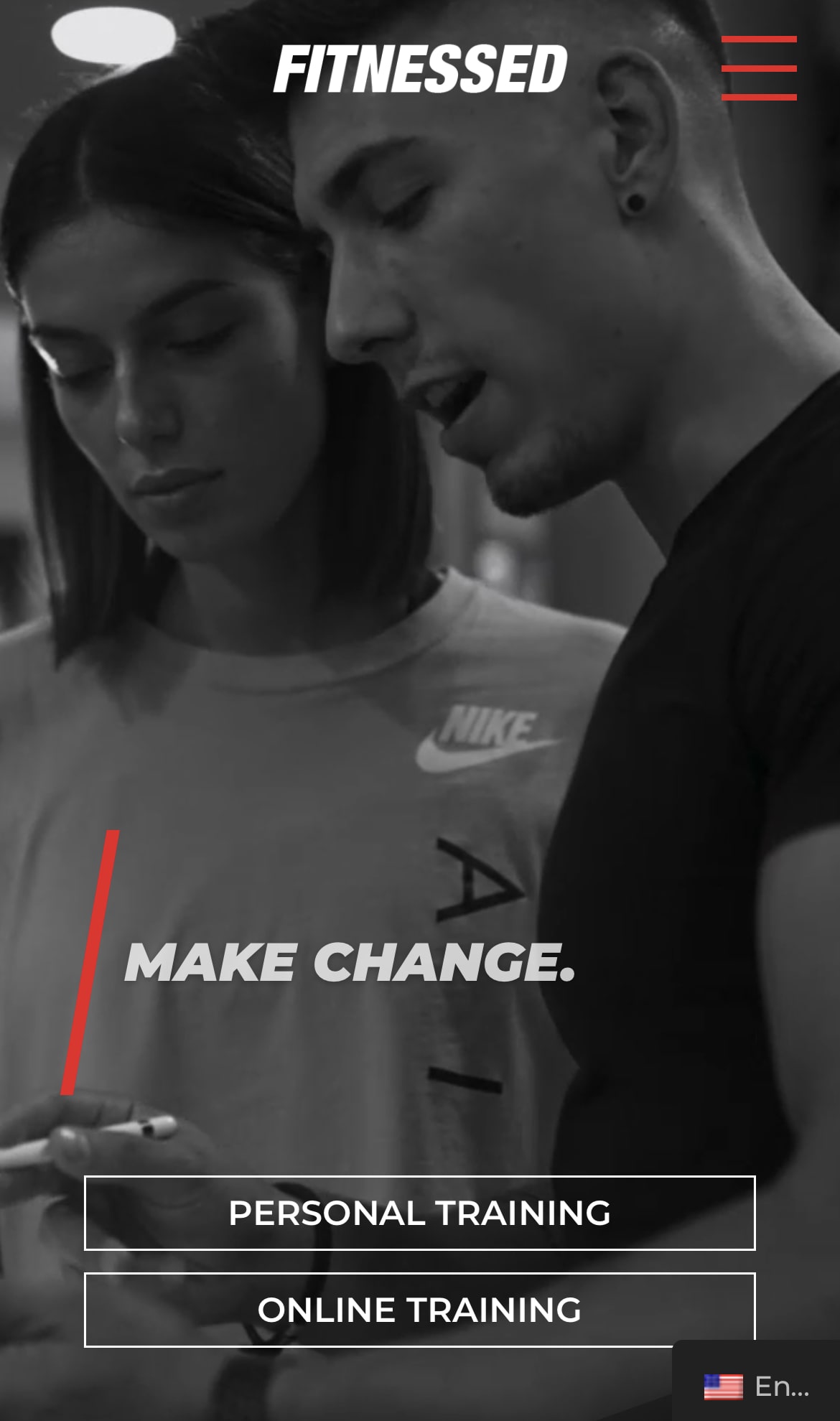
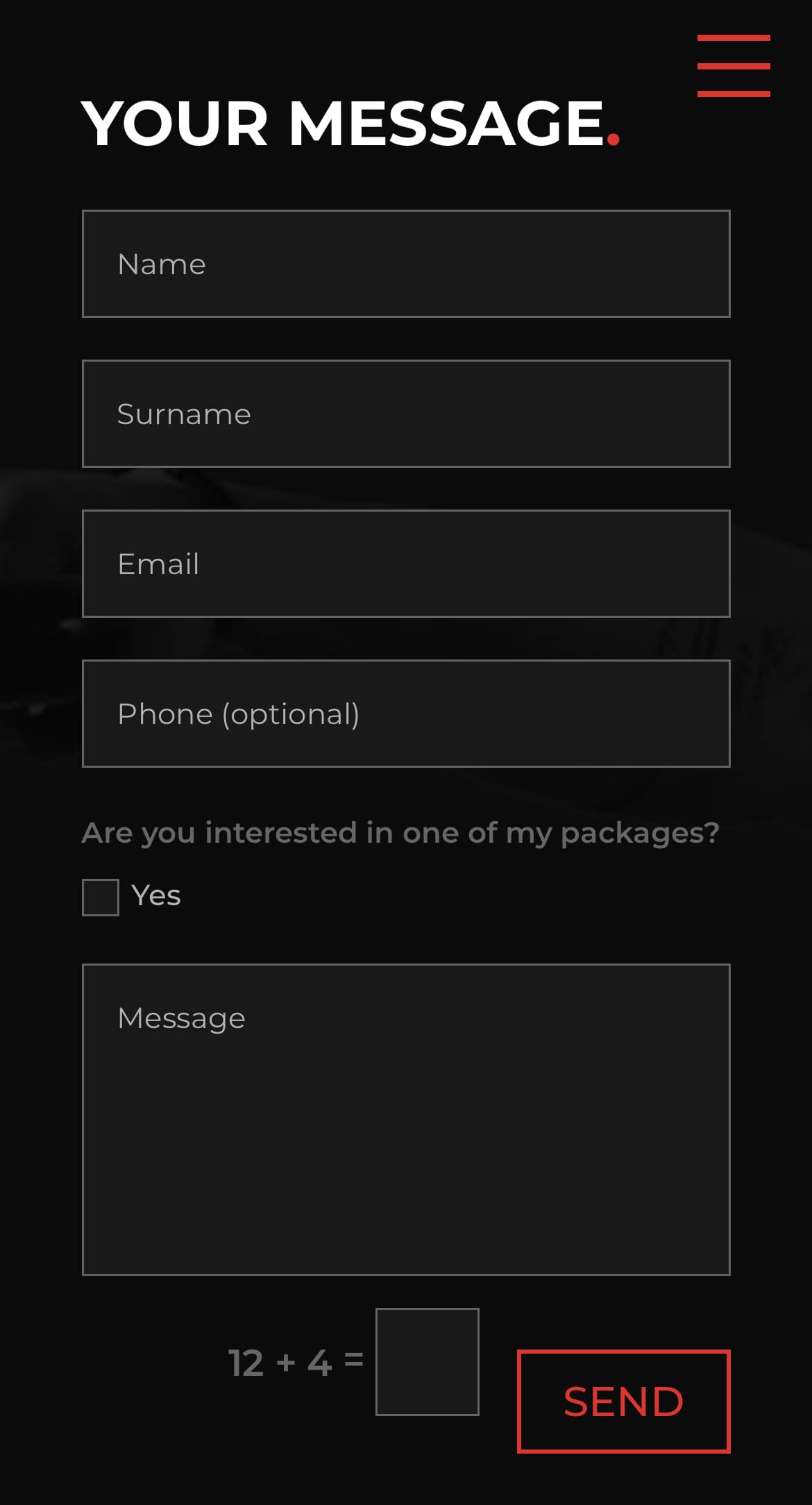
Regardless where the end-user is on the website, accessing the product and contact sections should be only one click away. Wireframes help to create a unique flow, navigating the end-user to his/her goal in just a few clicks. Call-To-Action buttons are a benefit both for Fitnessed and their clients.
With regard to the user experience, the design and the animations, I was able to come up with completely new ideas. From the product pages to the small user interfaces that are shown on the devices, I was allowed to design everything.
Regardless Fitnessed, I always try to get feedback from other sources. Feedback from developers, UX forums or even Reddit, helps the project get its finesse. Some suggestions were to merge all sections on only one page (not separate HTML pages) and to implement a hamburger navigation.

At the beginning, I carried out a market analysis together with Aldin's team, which quickly showed me that the websites of competitors were used more as pure information pages. We decided to take a completely opposite route. We wanted to turn the entire website into a presentation that you could really immerse yourself in.
I defined the advantages and functions that should be in the foreground for each section of the website. Then I created an individual design for each of these sections. That brought the website and the appearance to a completely new level. It was important to provide three languages: English, German and Bosnian, since the company aims the D.A.CH and Balkan regions. An eye-catching hero section will drive the user to continue exploring the website.
Aldin started to freelance as a personal trainer in his early ages, so he already had some clients he worked with. For the user research I invited some of those clients and conducted some user interviews. I asked the clients specific questions on how they want to be informed about new companies, they work, and who is behind the companies face. What they think about online trainings and what would drive them to attend one. The interview helped me to get a good overview of the client needs, and made the decision what features to implements on the website easier.
Starting to sketch, wire and mock creates a rough prototype how the end results could look like. I work with AdobeXD, so sharing my work with the client is made as easy as it gets. Getting constant feedback even from other sources, helps to lift projects to a higher level. The public version of the website is made with Divi, so the client has the opportunity to change things quickly and easy. A coded version is on my Github. During the coding process I tested the website with real end-users, so I make sure the website provide a satisfied user experience.
Getting sketch inspirations for fitnessed.net was very difficult. Presenting all my animations and transitions ideas with a pencil and a paper, was not easy at all. For the company to visualize my drawings I had to give 101% at the presentations, so everyone could catch up.
Regardless where the end-user is on the website, accessing the product and contact sections should be only one click away. Wireframes help to create a unique flow, navigating the end-user to his/her goal in just a few clicks. Call-To-Action buttons are a benefit both for Fitnessed and their clients.
With regard to the user experience, the design and the animations, I was able to come up with completely new ideas. From the product pages to the small user interfaces that are shown on the devices, I was allowed to design everything.
Regardless Fitnessed, I always try to get feedback from other sources. Feedback from developers, UX forums or even Reddit, helps the project get its finesse. Some suggestions were to merge all sections on only one page (not separate HTML pages) and to implement a hamburger navigation.

"Working with you was indeed a great experience. You managed to fill my mind with great ideas, and most importantly, you made it happen."